How to Lie With Statistics: Part I
06 Aug 2013Darrell Huff's How To Lie With Statistics is one of my all-time favorite books. The only problem with it is that it has become a bit dated (you have to calculate inflation on the fly to make sense of a lot of his examples involving money). Since people are still abusing statistics and data visualization today, I thought it would be fun to have some posts pointing out modern examples.
Today's deceptive abuse of data comes from this Mother Jones article, which in turn was inspired by this Bloomberg article. The quick summary is that gun-related deaths are projected to exceed traffic-related deaths. The Mother Jones article then follows up to point out that this has already happened in several states. Shock! Horror!
Here's the super sneaky plot from Bloomberg.

The tricks here. 1) The y-axis is cropped, making the trends appear larger. It looks like the firearms deaths per year has crossed 30,000 6 times. One could easily say that the number of firearm deaths has stayed constant over the last 30 years. 2) The real trick is that they are plotting raw numbers rather than per capita. For example, it looks like there were 30,000 firearm deaths in 1983 and again in 2005. But the US population grew by 57 million people in that time! If you sampled 10,000 random Americans in 1983, 13 of them would be killed by firearms. But grabbing 10,000 Americans in 2005, only 10 would get killed by firearms. Despite the curve looking like it's going up, you are actually safer from gun violence today than compared to just a few years ago.
Note the phrase "set to pass". It makes you think gun deaths are going up, so you are getting less safe. Really, the title should be "gun violence dropping at a slightly slower rate than traffic fatalities, which are also decreasing". But that doesn't sound scary and sell magazines. Or get web clicks, or whatever these guys do to generate revenue.
[caption id="attachment_126" align="alignnone" width="630"] Here's a more honest plot of the data, looking at things per capita.[/caption]
[caption id="attachment_127" align="alignnone" width="630"] Looking at just firearm homicides (so not including suicides and accidents), There's a HUGE drop over the last 20 years. Umm, no one really knows why this happened.[/caption]
It's like your had Joe at 290 lbs on a diet and Emily at 250 lbs on a diet. After 6 months, Joe is down to 220 lb (-70 lb) and Emily has dropped to 210 (-40 lb). Would you say Emily's weight is "set to pass" Joe's? I wouldn't recommend it since Emily has been working out and can still throw a solid punch at 210.
Inspired by Bloomberg's crappy plot, Mother Jones jumped in and pointed out that several states had "already hit this grisly milestone". Look, they made a handy map:
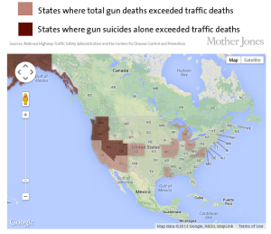
WOW, that makes it look like the west coast has a huge problem! Gun deaths have surged ahead of traffic deaths in lots of states. But I lived in Texas. Things I know about Texans, 1) they have a lot of guns, and 2) they can't drive for shit. Seriously, the fire hydrant outside my apartment got obliterated 3 times! And I only lived there for two years.


The lessons we can take away from these maps:
- Wyoming looks like it has a car problem
- Louisiana has a murdering-people-with-guns problem
- The west coast is one of the safer places when it comes to both driving and not getting shot.
- You can't see Alaska, but take my word for it that it has average gun homicide, but lots of gun deaths. This is driven by Alaska having nearly double the suicide rate of the US average.
Comparing my maps with the Mother Jones one, the only commonality seems to be Louisiana, where there are in fact a surprisingly large number of gun deaths. The rest of the states they shade a dangerous-looking brown are all on the safer side.
If they are going to make silly maps, I'm going to go ahead and show them how to really mis-interpret data. Well, we see that car deaths are dropping faster than gun deaths. Clearly, we need to take the lessons we've learned from cars and apply them to guns. From now on, all guns shall come with airbags, crumple zones, and rear defrosters. The next step in car safety will probably be the move to automated driverless cars. The same should be done with guns! Google will start making a shooterless gun--you just wave it around and advanced algorithms developed in the Stanford CS department will decide when to actually fire.
The real crime here is that this data is telling us some interesting stories, and raising lots of cool questions. But rather than address those, the authors bend the data to make some scare-stats. Things I see in the data:
- wow, traffic deaths have dropped like a rock! There's clearly been a ton of useful technology invented (anti-lock brakes, airbags, crumple zones, power steering, on and on). Check out this cool video of a '59 Chevy doing a head-on with a 2009 Chevy. The dummy in the '09 maybe breaks a leg, the '59 dummy is killed instantly. There's also things like seat-belt laws, anti-DUI adds, stricter rules on teen drivers, continually upgrading the deadliest roads. Lots of work has gone into making driving safer, and at least some of it works.
- There's a huge drop in auto deaths starting around 2007. Is that a result of the economic crash? Did people switch to the bus since they couldn't afford their cars? Did they just drive on fewer vacations? Do you just not drive much if you don't have to go to work? Should I be concerned that while the stock market has recovered, it doesn't look like people have gone back to driving (i.e., this has been a jobless, and thus comuteless, recovery)?
- The "tall pole" in gun violence is actually suicides. Hey, let's make sure everyone has access to mental health care. Seriously, be on the lookout for folks suffering from depression.
- While there are lots of reasons for driving being safer, the drop in gun violence is actually an amazing mystery. It doesn't look like violent crime is driven by the economy or police policies. Ironically, an excellent Mother Jones article makes a strong case that lead exposure is responsible for violent crime rates.
And, obligatory XKCDs:

How I feel after writing this post:
