Darrell Huff's How To Lie With Statistics is one of my all-time favorite books. The only problem with it is that it has become a bit dated (you have to calculate inflation on the fly to make sense of a lot of his examples involving money). Since people are still abusing statistics and data visualization today, I thought it would be fun to have some posts pointing out modern examples.
Today's deceptive abuse of data comes from this Mother Jones article, which in turn was inspired by this Bloomberg article. The quick summary is that gun-related deaths are projected to exceed traffic-related deaths. The Mother Jones article then follows up to point out that this has already happened in several states. Shock! Horror!
Here's the super sneaky plot from Bloomberg.
The tricks here. 1) The y-axis is cropped, making the trends appear larger. It looks like the firearms deaths per year has crossed 30,000 6 times. One could easily say that the number of firearm deaths has stayed constant over the last 30 years. 2) The real trick is that they are plotting raw numbers rather than per capita. For example, it looks like there were 30,000 firearm deaths in 1983 and again in 2005. But the US population grew by 57 million people in that time! If you sampled 10,000 random Americans in 1983, 13 of them would be killed by firearms. But grabbing 10,000 Americans in 2005, only 10 would get killed by firearms. Despite the curve looking like it's going up, you are actually safer from gun violence today than compared to just a few years ago.
Note the phrase "set to pass". It makes you think gun deaths are going up, so you are getting less safe. Really, the title should be "gun violence dropping at a slightly slower rate than traffic fatalities, which are also decreasing". But that doesn't sound scary and sell magazines. Or get web clicks, or whatever these guys do to generate revenue.
[caption id="attachment_126" align="alignnone" width="630"] Here's a more honest plot of the data, looking at things per capita.[/caption]
[caption id="attachment_127" align="alignnone" width="630"] Looking at just firearm homicides (so not including suicides and accidents), There's a HUGE drop over the last 20 years. Umm, no one really knows why this happened.[/caption]
It's like your had Joe at 290 lbs on a diet and Emily at 250 lbs on a diet. After 6 months, Joe is down to 220 lb (-70 lb) and Emily has dropped to 210 (-40 lb). Would you say Emily's weight is "set to pass" Joe's? I wouldn't recommend it since Emily has been working out and can still throw a solid punch at 210.
Inspired by Bloomberg's crappy plot, Mother Jones jumped in and pointed out that several states had "already hit this grisly milestone". Look, they made a handy map:
WOW, that makes it look like the west coast has a huge problem! Gun deaths have surged ahead of traffic deaths in lots of states. But I lived in Texas. Things I know about Texans, 1) they have a lot of guns, and 2) they can't drive for shit. Seriously, the fire hydrant outside my apartment got obliterated 3 times! And I only lived there for two years.
The lessons we can take away from these maps:
Wyoming looks like it has a car problem
Louisiana has a murdering-people-with-guns problem
The west coast is one of the safer places when it comes to both driving and not getting shot.
You can't see Alaska, but take my word for it that it has average gun homicide, but lots of gun deaths. This is driven by Alaska having nearly double the suicide rate of the US average.
Comparing my maps with the Mother Jones one, the only commonality seems to be Louisiana, where there are in fact a surprisingly large number of gun deaths. The rest of the states they shade a dangerous-looking brown are all on the safer side.
If they are going to make silly maps, I'm going to go ahead and show them how to really mis-interpret data. Well, we see that car deaths are dropping faster than gun deaths. Clearly, we need to take the lessons we've learned from cars and apply them to guns. From now on, all guns shall come with airbags, crumple zones, and rear defrosters. The next step in car safety will probably be the move to automated driverless cars. The same should be done with guns! Google will start making a shooterless gun--you just wave it around and advanced algorithms developed in the Stanford CS department will decide when to actually fire.
The real crime here is that this data is telling us some interesting stories, and raising lots of cool questions. But rather than address those, the authors bend the data to make some scare-stats. Things I see in the data:
wow, traffic deaths have dropped like a rock! There's clearly been a ton of useful technology invented (anti-lock brakes, airbags, crumple zones, power steering, on and on). Check out this cool video of a '59 Chevy doing a head-on with a 2009 Chevy. The dummy in the '09 maybe breaks a leg, the '59 dummy is killed instantly. There's also things like seat-belt laws, anti-DUI adds, stricter rules on teen drivers, continually upgrading the deadliest roads. Lots of work has gone into making driving safer, and at least some of it works.
There's a huge drop in auto deaths starting around 2007. Is that a result of the economic crash? Did people switch to the bus since they couldn't afford their cars? Did they just drive on fewer vacations? Do you just not drive much if you don't have to go to work? Should I be concerned that while the stock market has recovered, it doesn't look like people have gone back to driving (i.e., this has been a jobless, and thus comuteless, recovery)?
The "tall pole" in gun violence is actually suicides. Hey, let's make sure everyone has access to mental health care. Seriously, be on the lookout for folks suffering from depression.
While there are lots of reasons for driving being safer, the drop in gun violence is actually an amazing mystery. It doesn't look like violent crime is driven by the economy or police policies. Ironically, an excellent Mother Jones article makes a strong case that lead exposure is responsible for violent crime rates.
Anybody else remember Danny Almonte? He was the star Little League pitcher who led a team from the Bronx to a third place finish in the Little League World Series in 2001. Then it was revealed that Danny was actually two years older than his birth certificate said, making him too old for the league. The lesson here is that you can look like a damn good athlete if you are playing against littler kids.
I'd heard about the ice hockey relative age effect in the horrible Malcolm Gladwell book Outliers, and again in the slightly less horrible Freakenomics by Dunbar and Levitt.
If one looks at the distribution of birth dates in the general population, it's pretty random. There's about the same number of people born on every day of the year. That's not true when you look at professional hockey players, they are more likely to have birthdays early in the year.
The most common explanation for this is that it's a case of "the rich get richer"**. If we take a bunch of 6 year-old kids and put them in a hockey league, some will do well and others will suck. Coaches will spend more time with the talented kids, encouraging them to continue in the sport, putting them on all-star teams, etc. But out of those 6 year-olds, some will have just turned 6, while others are almost 7. That translates to some of the kids being 17% older than other. At young ages, that can be the difference between a couple growth spurts. Coaches and parents are probably pretty bad at telling the difference between a "talented" kid and one that is simply slightly older than everyone else. Just like Danny Almonte, the older kids will look impressive just because they are older. Once a kid gets labeled as skilled, even if it's only because he's older than the competition, he gets extra resources and his lead over the other kids grows. (note: I came back and switched to all male pronouns in this section, you'll see why shortly)
That's a fine story for how the relative age effect gets started. I'm a little disappointed that I can't find anyone who's gone out and tested it though. After all, maybe it's just that younger kids get sick of losing to the older kids and quit more quickly.
I was surprised to hear that there's also an age-effect in tennis. I thought there would be little to no birthday bias in tennis because junior tennis tournaments are usually organized in two-year age ranges (e.g., 14 and 15 year-olds are placed in the same brackets and play against each other). So even if you are born in January, you still spend every-other year playing against a field where half the competition is older than you.
It's surprisingly easy to go out on the intertubes and scape the birth dates of professional and junior athletes, so I did. After ruining a couple credit ratings, I got around to looking for relative age effects. Results!
[caption id="attachment_96" align="alignnone" width="300"] Age distribution of boys tennis players. Significantly peaked early in the year.[/caption]
[caption id="attachment_97" align="alignnone" width="300"] Age distribution of girls tennis players. Consistent with random (but some odd-looking spikes, might be nice to get a larger sample).[/caption]
[caption id="attachment_98" align="alignnone" width="300"] Age distribution of NBA basketball players. Consistent with random.[/caption]
[caption id="attachment_99" align="alignnone" width="300"] Age Distribution of NFL football players. Consistent with random.[/caption]
[caption id="attachment_100" align="alignnone" width="300"] Age Distribution of NHL hockey players. Peaked significantly early in the year.[/caption]
For each sport, I took the players and calculated which day of the year (1-365) they were born on. I confess, I didn't adjust for leap years. Statistical p-values from a KS-test comparing to a flat distribution are listed, with significantly different distribution in red.
This is also cool since it is a way to address the issue of nature vs nurture in what makes an elite athlete. Since genes should be the same regardless of when someone is born, it's a good bet that the RAE is a purely environmental effect. Note the cool excerpt over at si from a book looking at nature v nurture in athletics.
It looks like the NBA, NFL, and girls tennis have no relative age effects. Meanwhile, theNHL, and boys tennis have significant age effects. Others have also found RAE for MLB baseball players. The NBA doesn't surprise me too much. You can't teach height, so it might be harder to hold on to an early advantage in youth basketball. You might spend your junior high years as a dominant 6-foot tall center, only to wind up point-guard sized in high school. All that time you spent practicing your post moves won't help much if you stop growing at 6'-2".
Let's see if we can visualize where the differences may be coming from. On one side, we have hockey, baseball, and boys tennis all with strong RAE,
and then we have basketball, football, and girls tennis with no RAE,
It's hard to find a pattern that explains which sports have RAEs and which don't. Baseball and tennis are more focused on individual skill, but then why doesn't girl's tennis show an RAE? Football and basketball are more physical, but then so is hockey, so why does it still have an RAE? Looking at the images above (grabbed haphazardly from google image searches), it sure looks like there's one group of all white guys, and then everyone else in the other group. I checked to see if NFL quarterbacks (one of the few football positions where the majority of players are white) have an RAE, but they don't.
Can we come up with a good explanation for which sports have RAEs and which don't? Here are my two stabs in the dark:
1) Football and basketball are intrinsically more physical sports. If a late bloomer suddenly hits 6' 7", a basketball coach will try to develop him even if he hasn't had much previous experience. A player's relative age doesn't matter, as long as they eventually hit some physical mile-stone, they can get a shot at playing. I even just read that an Olympic discus player is getting a shot trying out for an NFL football team. This isn't the case with the "skill" sports. If you haven't mastered a backhand or fielding grounders by the time your 13, you're never going to make the pros. Coaches in the skill sports aren't looking for late bloomers they can develop.
2) Parents invest a lot of resources developing potential athletic talent in their kids. Most of the theories of RAEs involve coaches giving more attention to older kids, but I think a large part of it has to be parents seeing their kids being successful at an early age and encouraging them to continue in a sport. If you ask a coach if your kid has talent and should be signed up for more classes, the coach will undoubtedly say yes (kinda like taking a car in for a free brake inspection, you're going to be told you need new brakes). But when a parent actually sees their kid is doing well at a sport, that's what will convince them to actually shell out the extra cash and time for private lessons, a fancier hockey stick, etc. I don't think it's much of a stretch to think that parents are susceptible to being gender biased, and are more on the lookout for athletically gifted sons than gifted daughters.
3) Of course, it could be a combination of the two above. Some sports are easier to pick up later in life, AND boys who show early promise in a sport (by being slightly older than their competition) end up getting more encouragement and resources than others. There's a sociology PhD thesis in there somewhere...somebody go get on that.
Some things I'd love to see:
Can anyone find a girls/women's sport that does shows an RAE?
How early does the RAE appear in a sport? The top tier 8 year-olds? 12 year-olds? Once there is an RAE does it change in strength with time?
Sport leagues tend to use Jan 1 as the date cutoff for age brackets, while schools use different dates (usually around September). Could schools be eliminating RAEs in some sports and not others? For example, scouts and college coaches watch high school football games, but not tennis, instead relying on things like USTA rankings.
**This rich-get-richer effect is eerily similar to how professional astronomy works as well. Lots of newly minted PhD's apply for prestigious fellowship. The few that land them tend to go on and have solid careers. Was it because the fellowship committee did a good job selecting the best applicants, or would any new grad have been successful given the extra resources and exposure that come with a prize fellowship?
I just finished reading Nate Silver's The Signal and the Noise: Why So Many Predictions Fail — but Some Don't. I enjoyed it overall, probably the best basic introduction to Bayesian reasoning I've seen. Silver runs through a huge variety of fields that make predictions--earthquake predictions, election predictions, baseball player performance predictions, stock market predictions, weather predictions, on and on. It makes for a fun read, and is a great example of how basic math/statistics form the basis of every meaningful field of study.
I do have to complain about a few glaring typos and things.
The very fitrst chess diagram he shows is wrong. Really, only 3 moves into the game and you can't get it right?
[caption id="attachment_76" align="alignnone" width="257"] This get's labeled "Position after Kasperov's [playing white] 3rd move in game 1" Go ahead, try to make a chess board look like that in 3 moves.[/caption]
Quoting Richard Rood, "At NASA, I finally realized that the definition of rocket science is using relatively simple psychics to solve complex problems" [emphasis added]. As someone who has to explain the difference between astronomers and astrologers, this struck me as funny.
Silver keeps using the word "reflecting" when he means absorption and re-emission. This is actually a really important distinction in the whole global warming biz. Light that reflects off earth's surface (or cloud tops) heads right back out to space, it doesn't do any heating. Light that gets absorbed and then re-emitted in the infrared is what gets trapped by greenhouse gases. Maybe I'm wrong, but given the previous two typos, my Baysian prior is strongly set to think this is an error in the book. I also think he gets a little too cute trying to keep some skeptical street cred when looking at the climate models.
Silver spends a lot of time comparing earthquake predictions to terrorist attacks, and makes a big deal out of both of them having power-law distributions. As an astronomer, I see a lot of power-laws and have become a bit jaded. It's become a bit of a joke that you can plot just about anything on a log-log scale and have it look like a meaningful relation. Anyway, making predictions from extrapolated power-laws sounded like a dumb idea before I read the book, and it still sounds like a bad idea.
I was surprised he didn't include a chapter on technology predictions like the Y2k bug predictions or if/when Moore's Law will end.
Some highlights include:
Great chapter on stock market predictions. Take away message is that pretty much the only people who beat the market consistently have insider info.
Step-by-step example of how to useBayesian reasoning to calculate the probability your spouse is cheating on you if you discover someone else's underwear in your dresser. Seriously.
"some dufus has to reboot al qaeda's servers"
Most "for-profit" weather forecasters have a "wet bias". They intentionally over-predict rain.
He talks a lot about Philip E. Tetlock's Expert Political Judgment, which is also an awesome book, so go read that first.
The book includes a lot of details about Silver's career path--going from a boring office job, to baseball analytics, to on-line poker, to election forecasting at 538. Safe to say, no one would have predicted that one.
Overall rating: Good book, I probably should have waited for the paperback to come out though.
There are two types of Gen-Xers, those that can quote a Seinfeld reference for any occasion, and those that can quote a Simpsons line for any occasion. I happen to be a Simpsons Gen-Xer. Not that there's anything wrong with being a Seinfeld fan, I just couldn't get into it after my parents demanded I explain the "Deloris" episode. The other great inter-X-Gen schism is if The Joshua Tree or Achtung Baby! is U2's greatest album**.
Over the years, the Simpsons have had numerous celebrity guests. A rather shocking statistic is that 57 of those guests have died after appearing on the Simpsons. Upon seeing that I thought, "Wow, that's a surprisingly large number of dead celebrities!", followed shortly by, "How can we get the Kardashians to appear on the Simpsons?"
Of course, 57 deaths doesn't sound nearly as bad when you consider the show has been going for 24 seasons and featured over 570 guests. But I thought it would be fun to see how many celebrity deaths we should expect from the Simpsons. Is there really a "Curse of the Simpsons"?
Wikipedia has a handy list of all the Simpsons' guest stars . Wikipedia also has a standardized format for listing a person's birth and death date, so I just wrote a python script to grab all the info and ended up with a list of names, birth year, death year, and season people appeared on the show. Next up, I grabbed an actuarial table from the US government and made a table of death probabilities for each guest star each year. Finally, I did a little Monte Carlo simulation to see how many guests die on average each year.
Results:
Here's a plot of how many total guest stars have died through the years:
Now we add in how many deaths the actuarial table says we should see, along with dashed lines showing some of the most extreme results
It turns out, rather than 57 deaths being a lot, it's far fewer than we should have expected. The actuarial tables say there should have been 83 dead celebrities by now! I've also drawn in the 99th and 1st percentile lines, and the observed result is lower even than that. To get a good fit to the data, I can just shift the simulated curve 3 years like so:
So there is no curse, celebrities who appear on the Simpsons live about an extra 3 years (on average at least). If we look at the ages Simpson guests have been dying, the average is 76 years, with some folks pushing 100.
[caption id="attachment_15" align="alignright" width="168"] I am the Eggman![/caption]
As a sanity check of the code, I looked to see how many surviving Beatles were predicted (George, Paul, and Ringo have all done guest voices). In 44% of the sims, all three survived, but in 42% at least one died (matching reality, Paul
and Ringo are currently the only surviving Beatles), and 13% of the time 2 had died. Finally, in 1% of the sims there were no surviving Beatles by 2013. This matches the manual calculation from the actuary table.
To explain what's going on, we just need to turn to this USNews article that asks Do Rich People Live Longer? Short answer: Yes. I used an actuarial table for average Americans, but celebrities who appear on the Simpsons are usually quite wealthy. Looking at the numbers in the USNews article, people in the upper half of the earnings distribution live 2.7 years longer than average, almost the exact shift that we see between the simulation and observations.
I really like this because the result was unexpected. I thought I'd find Simpsons' guests were dying off at the average rate--maybe just a tad faster than average since there have been several stars who died relatively young (Michael Jackson, Phil Hartman, Gary Coleman). I figured there would be a subtle, but not statistically significant Curse. Instead, it turns out there's a very significant anit-Curse. I made some jokes on twitter that perhaps Justin Bieber would be the next to fall to the Curse of the Simpsons. Now that seems especially silly. Even if Justin manages to spend away his fortune, he can still get amazing healthcare as a Canadian. Unless we continue to reform American healthcare, you it's a good bet Bieber will outlive many of his American fans.
I bet a similar effect would show up for other celebrity groups (Academy Award winners, SLN hosts, etc.). I wonder if pro-atheletes also have longer lives, or if their shorter careers or physical wear and tear prevent them gaining an advantage. Fun things to look at in the future if I ever need to boost blog traffic with misleading sensationalist headlines again.
All this thinking about mortality can be a little depressing though. Don't worry, there's a Simpsons reference for that.
[caption id="" align="aligncenter" width="191"] "See, I made a graph. I make lots of graphs." Me too Lisa, me too.[/caption]

 Here's a more honest plot of the data, looking at things per capita.[/caption]
 Looking at just firearm homicides (so not including suicides and accidents), There's a HUGE drop over the last 20 years. Umm, no one really knows why this happened.[/caption]
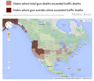


 "See, I made a graph. I make lots of graphs."